Faith/Void
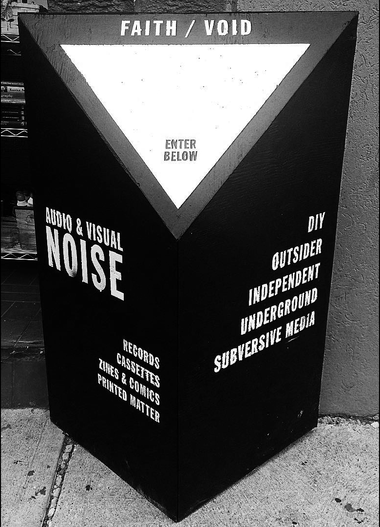
FAITH / VOID was a project that I founded and operated from 2015 to 2019. Located at 894 College Street in Toronto, the space functioned as both a retail store and mixed-use community arts and music venue. The aim of the project was to provide a platform for underground culture and DIY efforts; using the space to expose people to alternative modes of thinking, creating and connecting.
As the sole proprieter and operator of this small business and venue space, I was able to dedicate all of my energy into creating a community hub; a place where culture was created and like-minded people could come together.
I had the opportunity to utilize my skills as a desginer to create a complete visual identity and physical environment that reflected it.
I had the opportunity to utilize my skills as a desginer to create a complete visual identity and physical environment that reflected it.

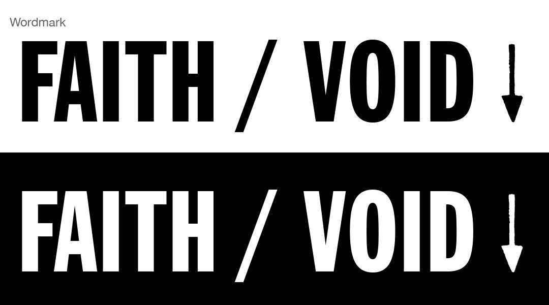
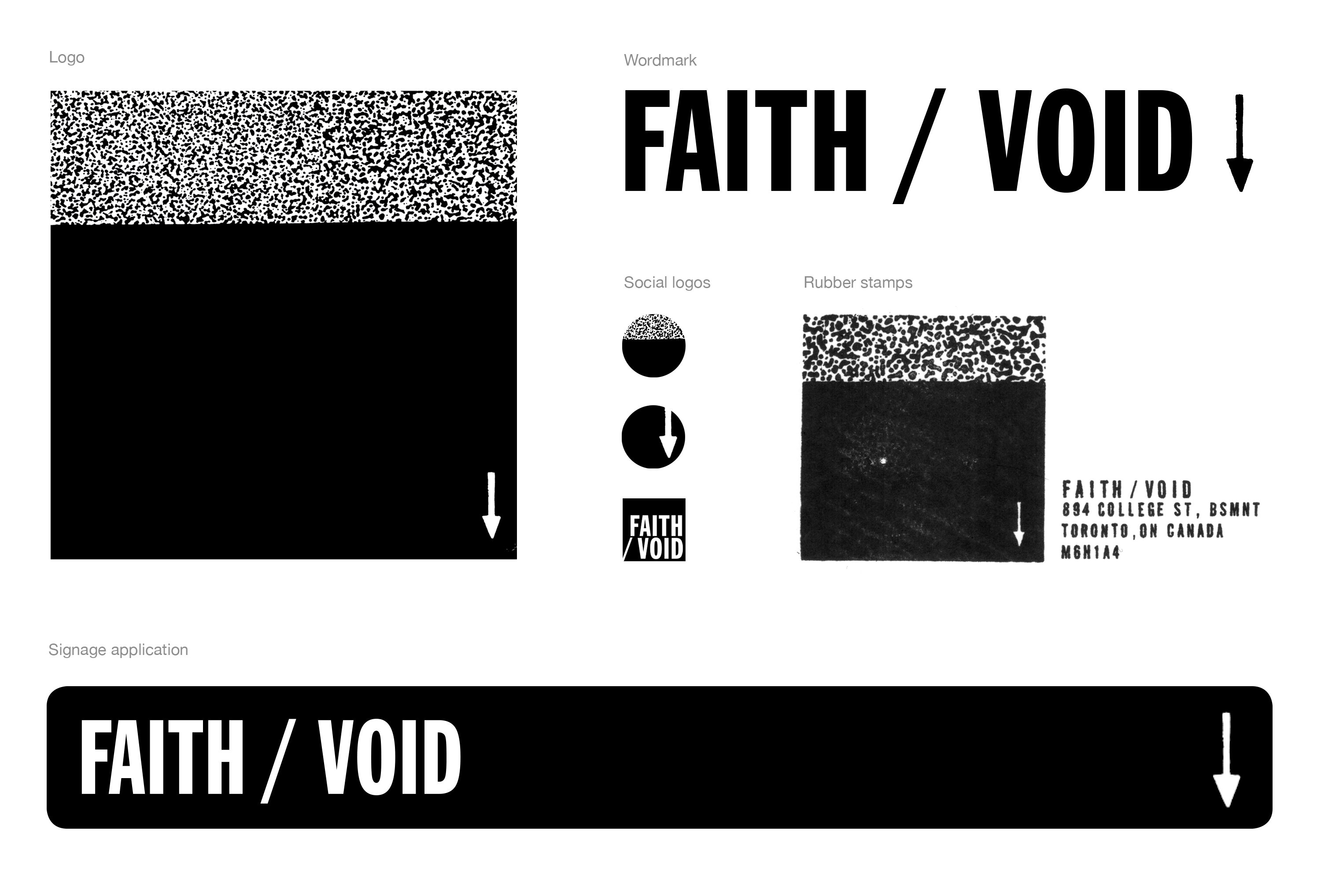
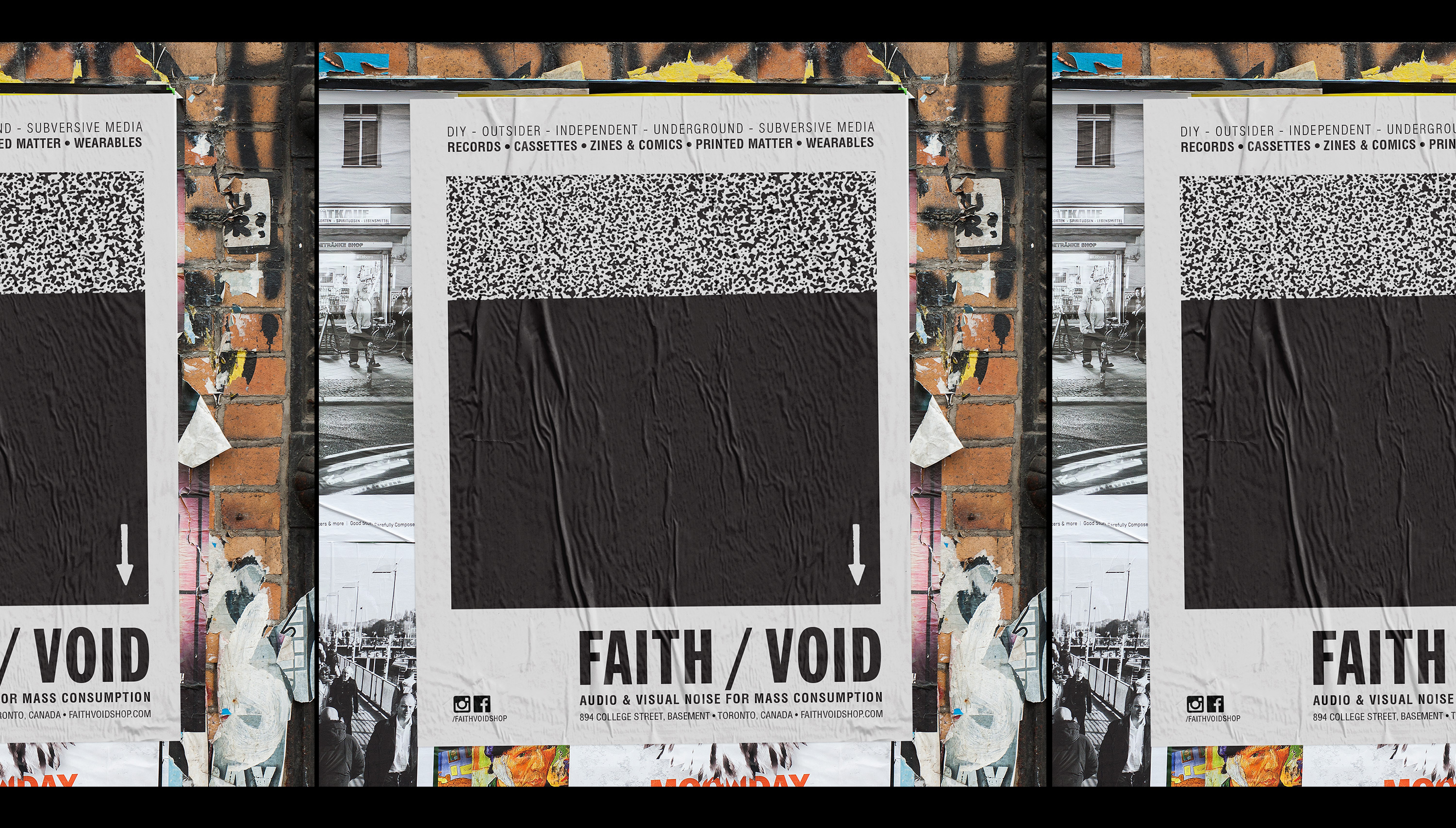
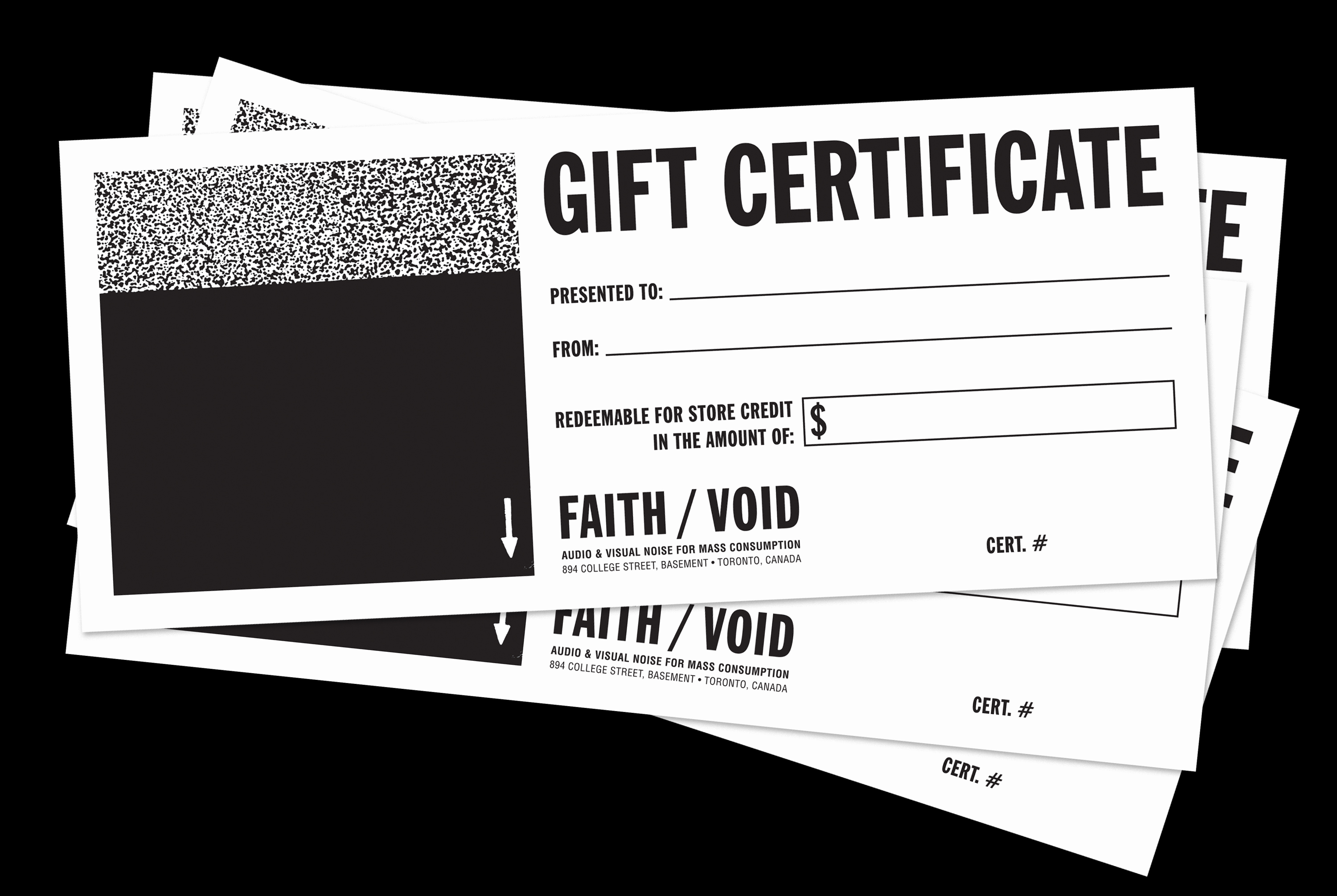
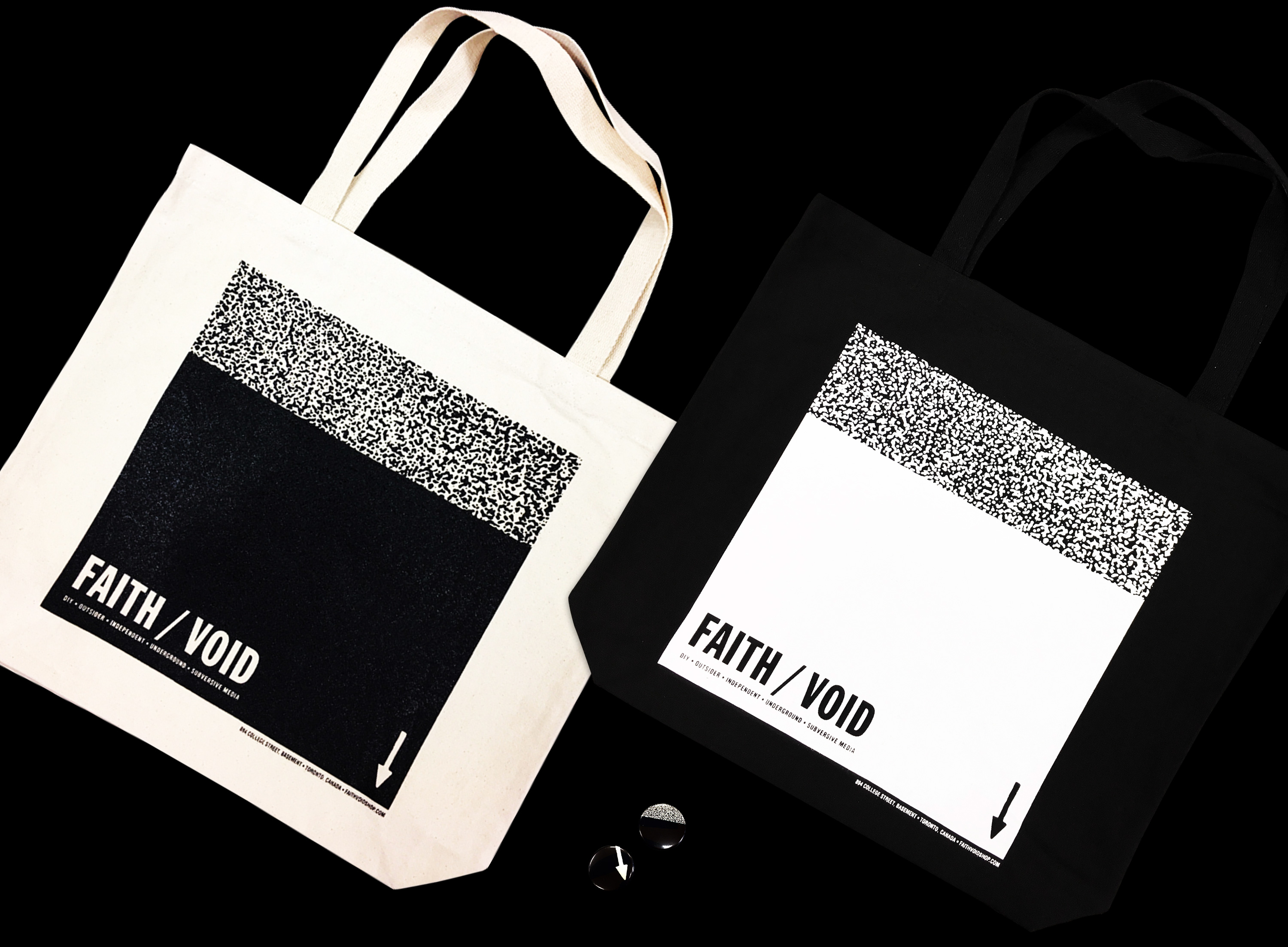
The visual identity and branding aesthetic references black and white Xerox photocopies and utilitarian Letraset fonts - common elements to DIY show flyers of the 80s and 90s.
The visual language was to be instantly recongnizable and aligned with subculture, but not be limited to any particular sub-genre. I wanted to create something that looked modern while also referencing the past. The outcome was simple, minimal and produced a system of elements that could be easily be applied to a range of materials.
The visual language was to be instantly recongnizable and aligned with subculture, but not be limited to any particular sub-genre. I wanted to create something that looked modern while also referencing the past. The outcome was simple, minimal and produced a system of elements that could be easily be applied to a range of materials.


Audio & Visual Noise For Mass Consumption was FAITH/VOID’s online web store component. This expanded the shop’s reach and allowed items to be purchased internationally through mail order. A minimal, user-friendly interface was established that set it apart from other peers at the time. The online store allowed people from all around the world to support the space and have access to the goods it carried.


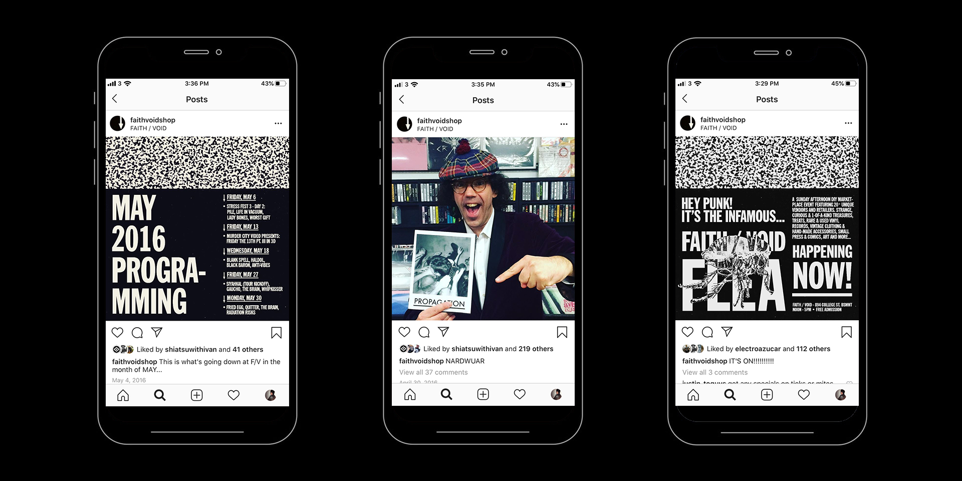
Social media was utilized to promote upcoming events, showcase new inventory, and give visibility to the people who gave the space life. Customers, show attendees, touring bands, visitors from afar, employees and volunteers regularly appeared on the social media accounts; connecting the international audience with the local community.
Facebook’s e-commerce tool was also integrated and allowed users to purchase items directly from these platforms.
Facebook’s e-commerce tool was also integrated and allowed users to purchase items directly from these platforms.

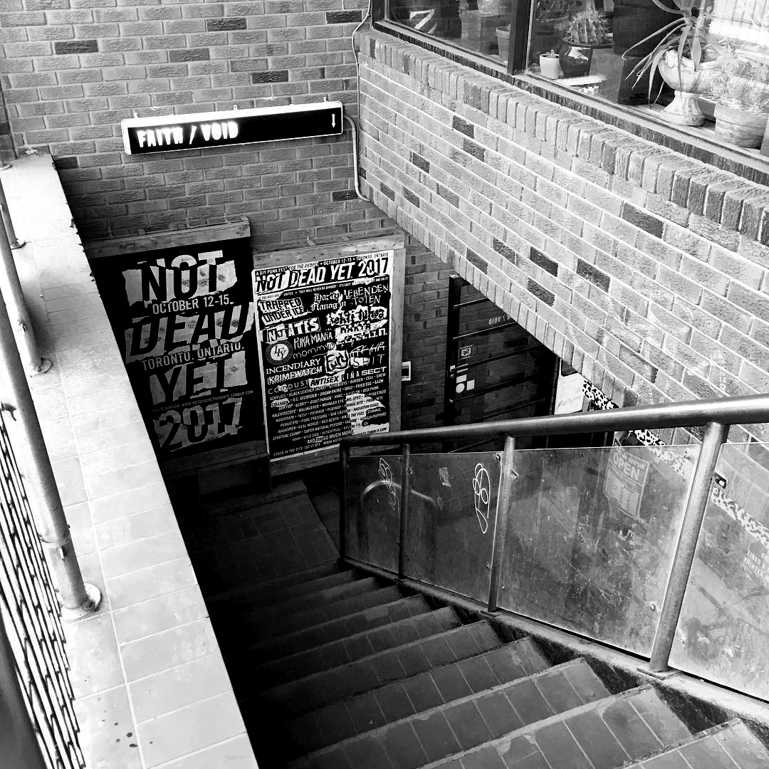
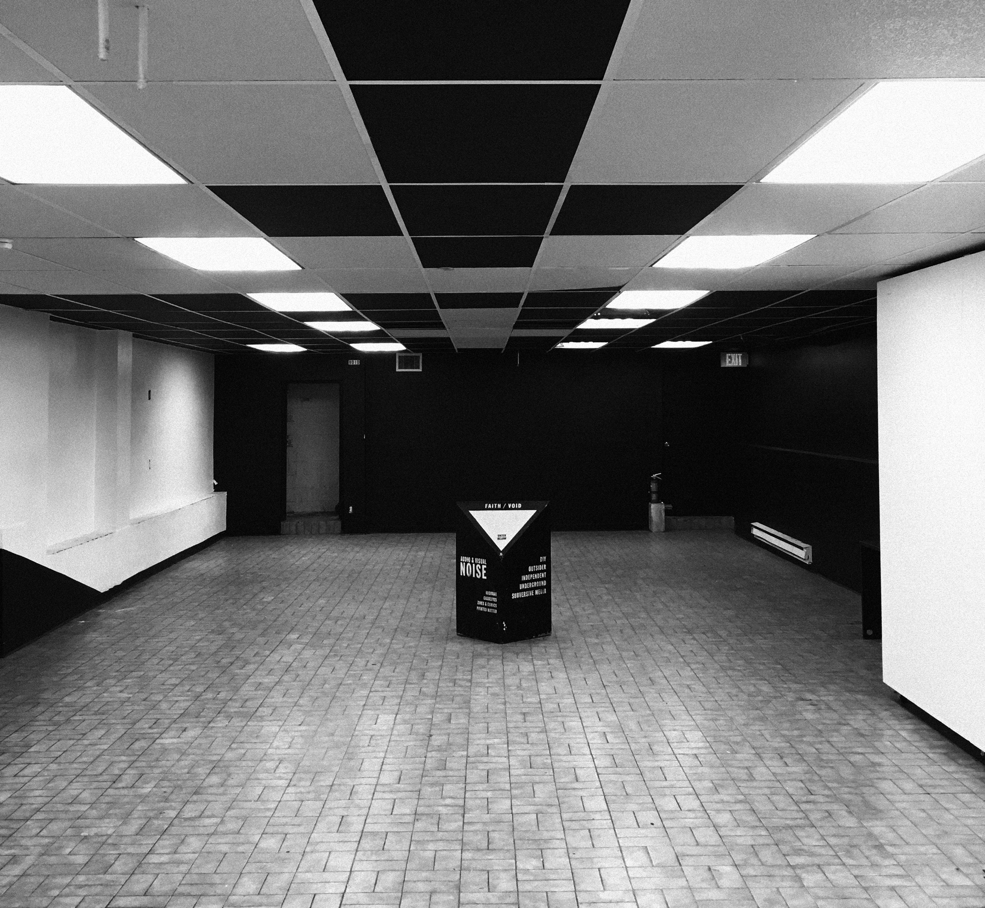
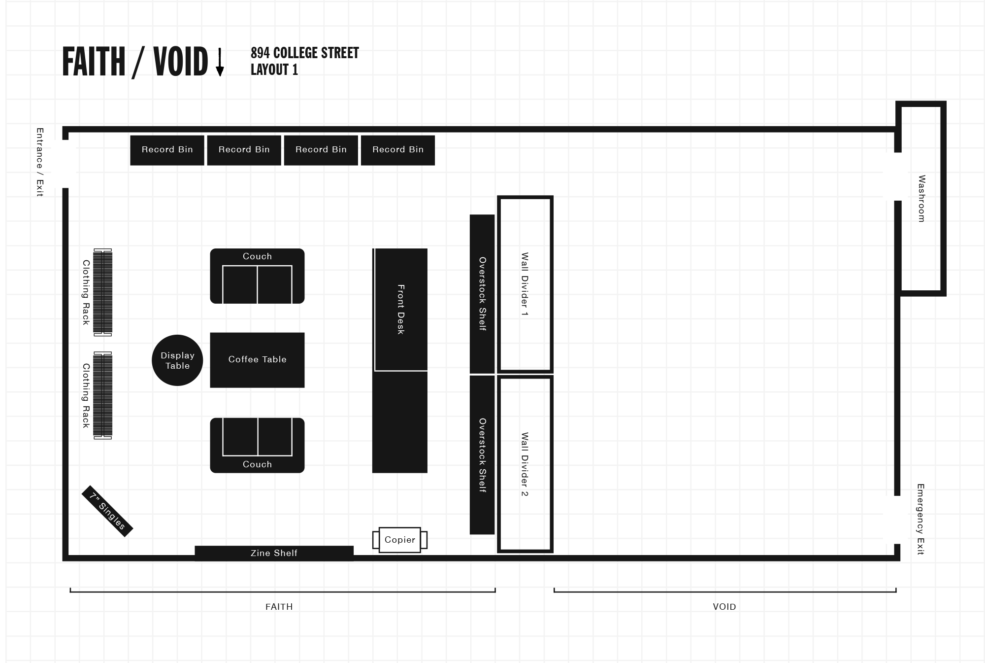
FAITH/VOID was located in a 1,350 square-foot basement storefront. Due to the multi-use nature of the space, all fixtures were designed to be modular and moveable. The record bins, front desk and dividing walls were built on castors so that the space could be changed quickly to suit different uses.
The moveable walls could be used to divide the space into smaller areas, as hanging wall space for art exhibitions or as a projection surface for film screenings. They were also used as storage space for music equipment, overstock, supplies and extra seating.
The moveable walls could be used to divide the space into smaller areas, as hanging wall space for art exhibitions or as a projection surface for film screenings. They were also used as storage space for music equipment, overstock, supplies and extra seating.
Changing and combining the modular elements in different ways allowed me to experiment with how the organization of the space influenced the way people moved through it and interacted with it.

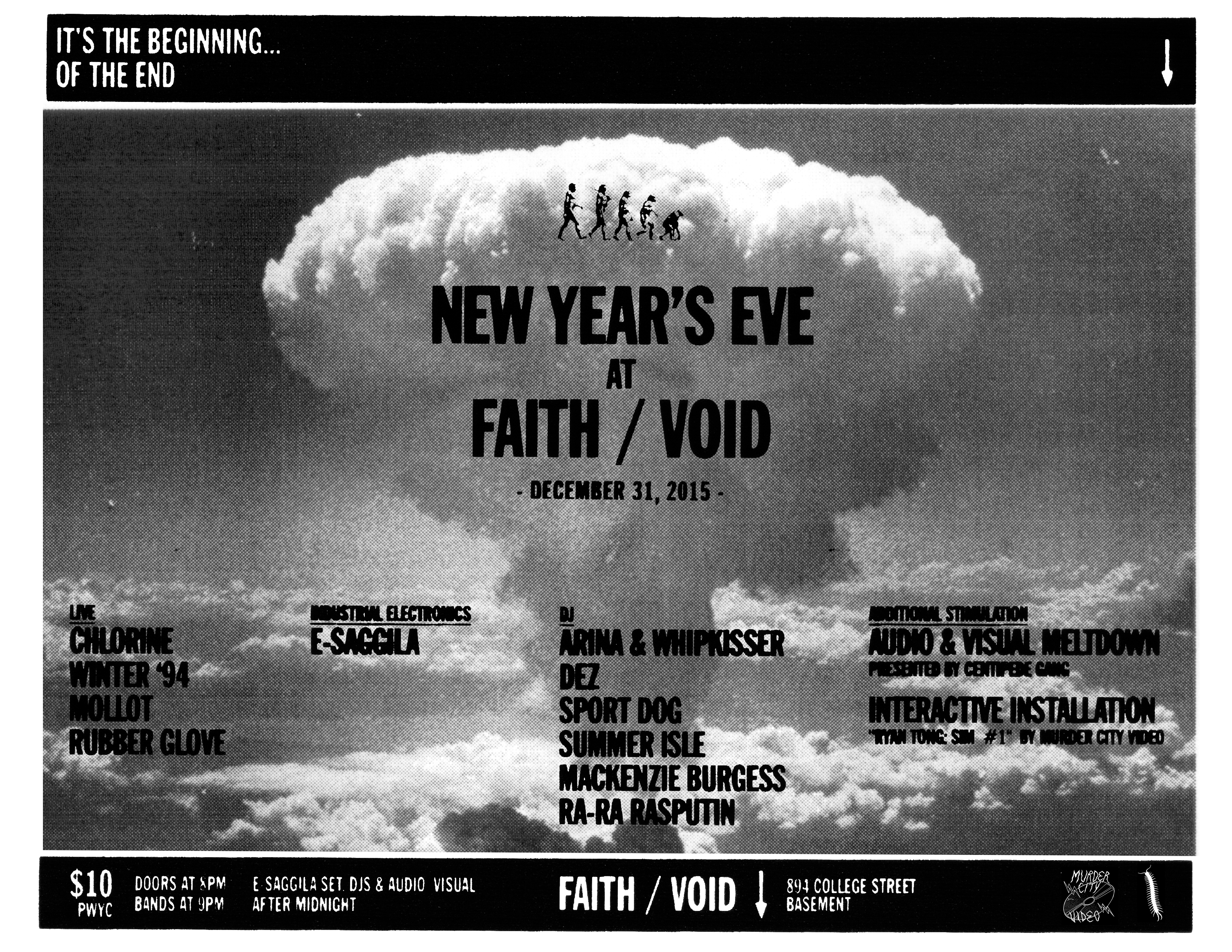
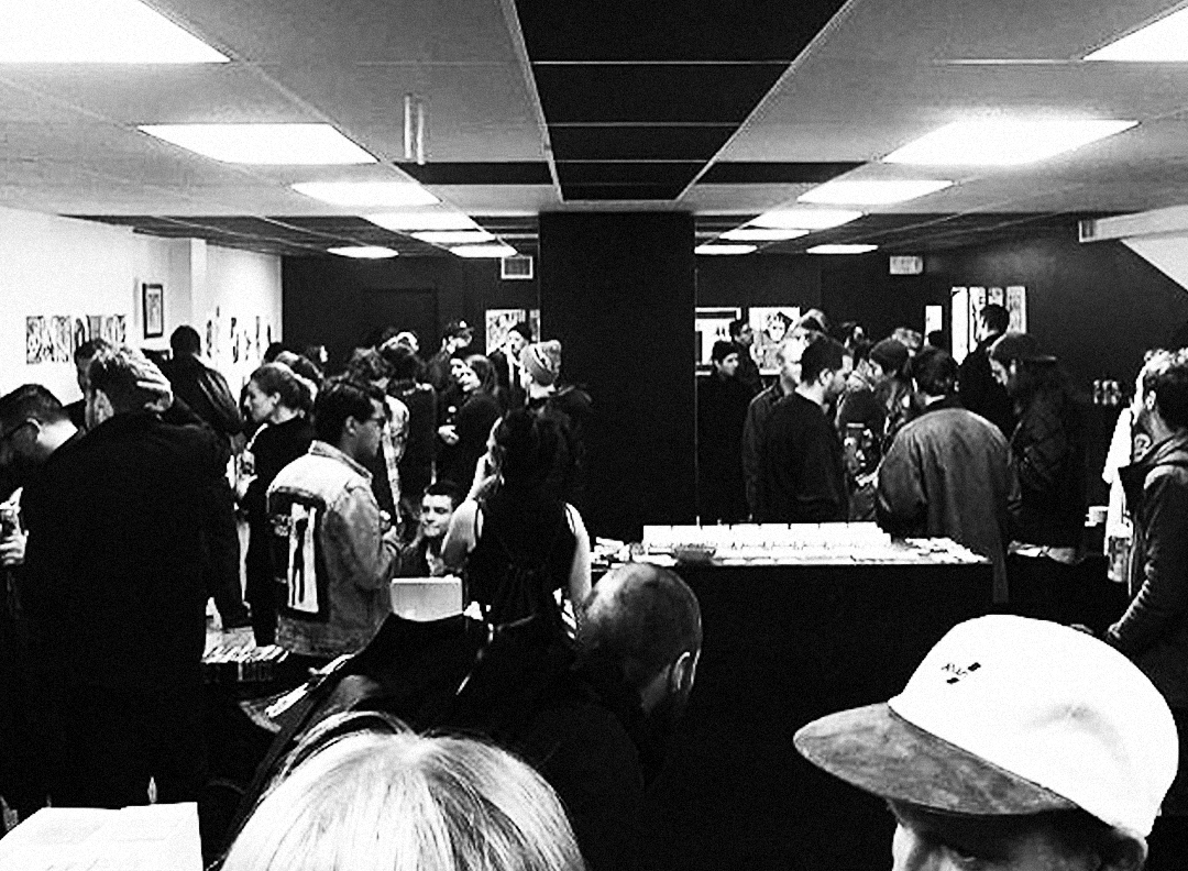
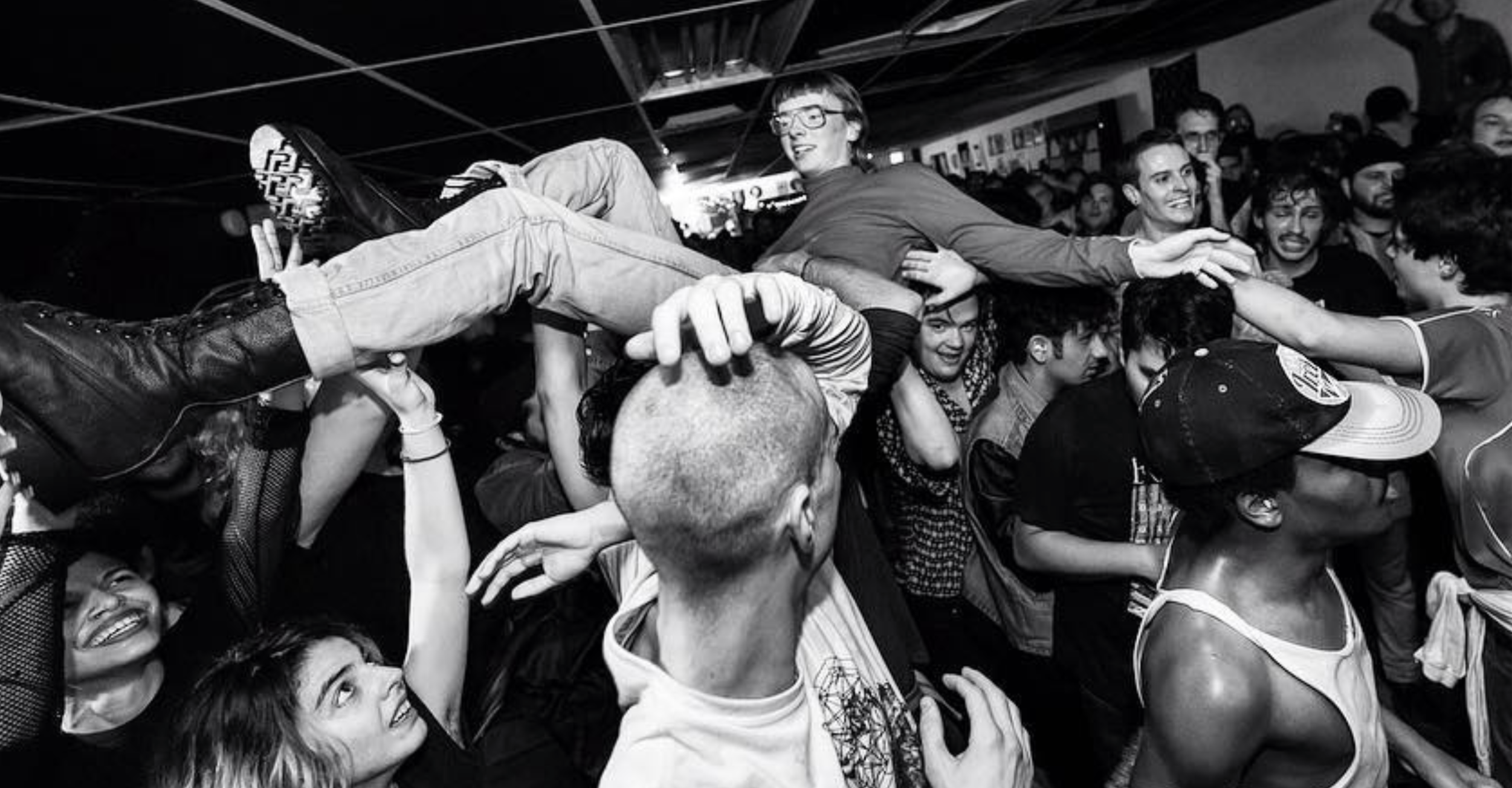
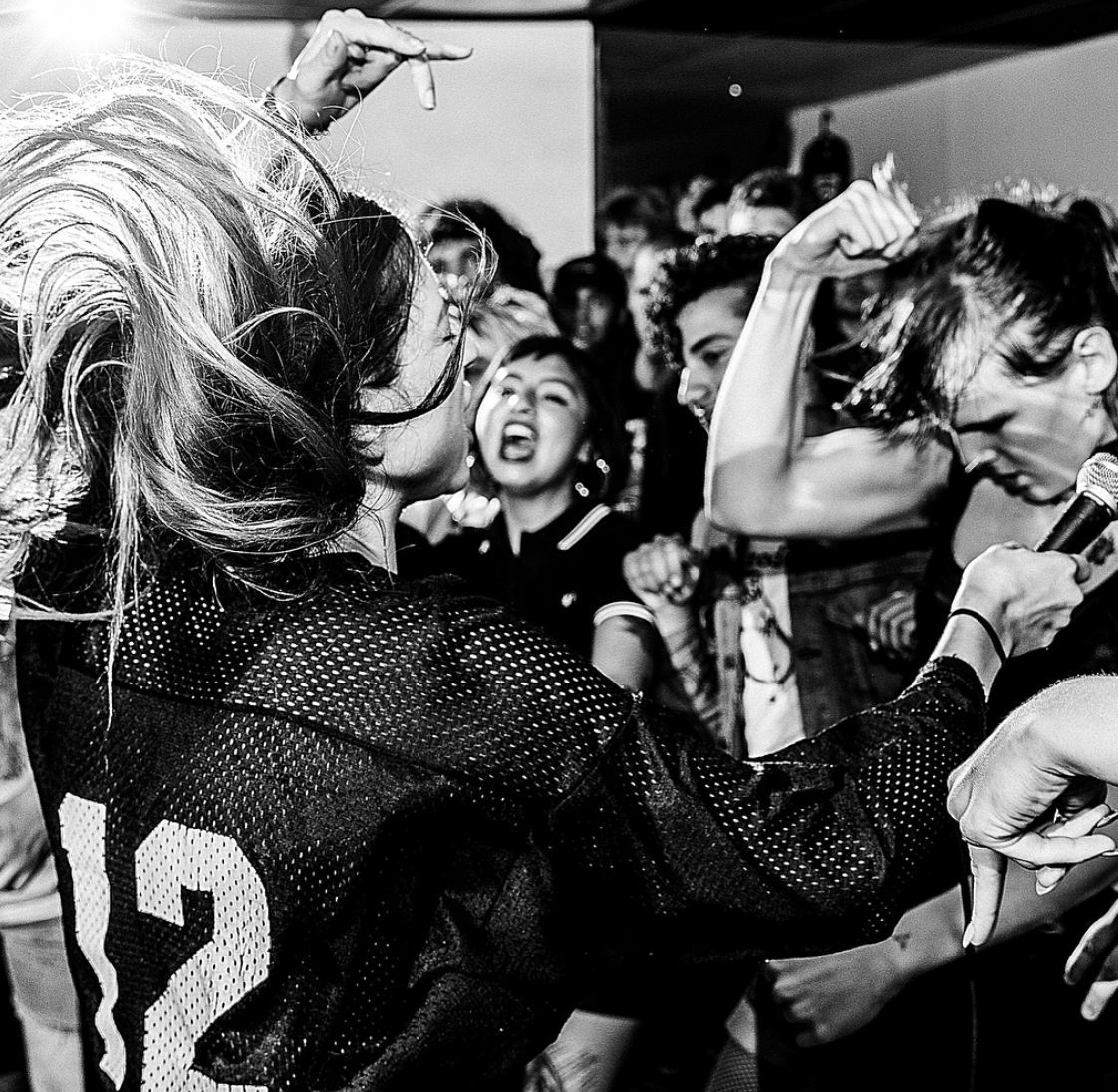
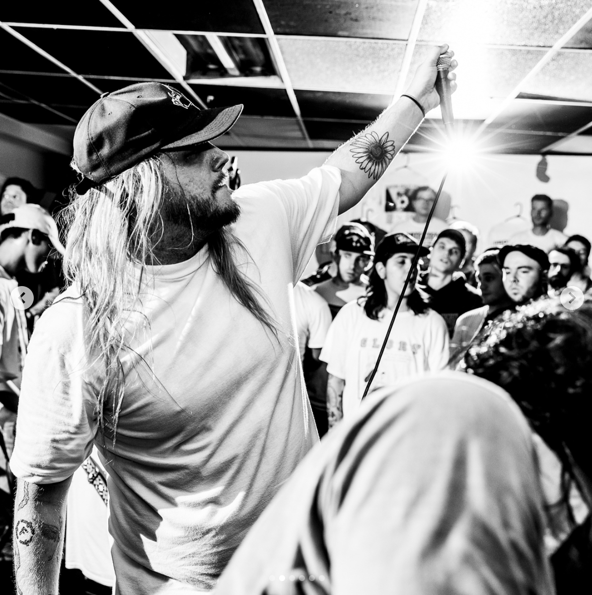
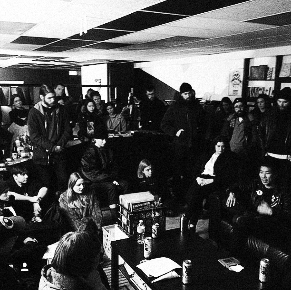
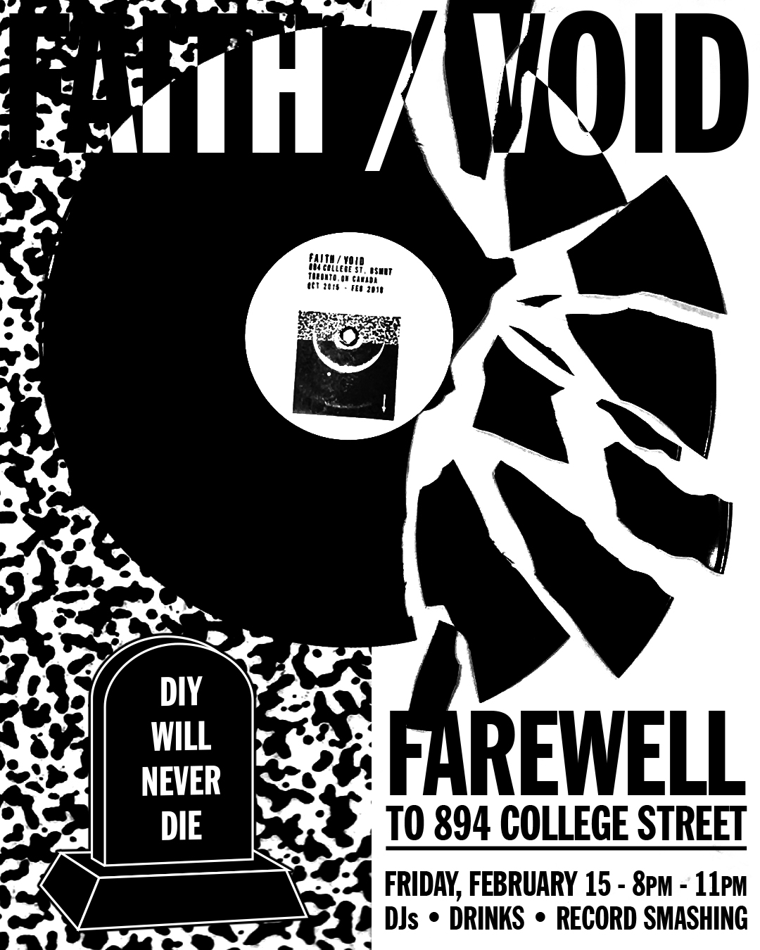
Over the course of its run, FAITH/VOID hosted over 200 events including live music performances, film screenings, art exhibitions, book launches, readings, community workshops and vendor markets. Every one of these events was organized, promoted and run by members of the Toronto DIY music and arts community.
FAITH/VOID became a hub for the local and international DIY music community, with bands and people visiting from all over the world. Thanks to the reach of social media and annual DIY international music festivals such as NOT DEAD YET, the space became a destination for fans of the underground.
FAITH/VOID became a hub for the local and international DIY music community, with bands and people visiting from all over the world. Thanks to the reach of social media and annual DIY international music festivals such as NOT DEAD YET, the space became a destination for fans of the underground.


Design Process
The name FAITH / VOID is a reference to Dischord Records’ first split 12” release by the bands The Faith and Void (known as the Faith/Void split).
It represents the two aspects of the space - the retail shop (Faith) and the venue space (Void).
I wanted the identity of the branding to exist in the middle of a powerful duality - a play between total involvement and the opportunity that exists in a space or void. I wanted explore these concepts because I believed them to be central to the DIY movement from its inception.
The icons and wordmark make reference to these coexisting dualities, while also visually referring to xerox photocopies and letraset fonts - important tools that embody the spirit of “Do It Yourself”.
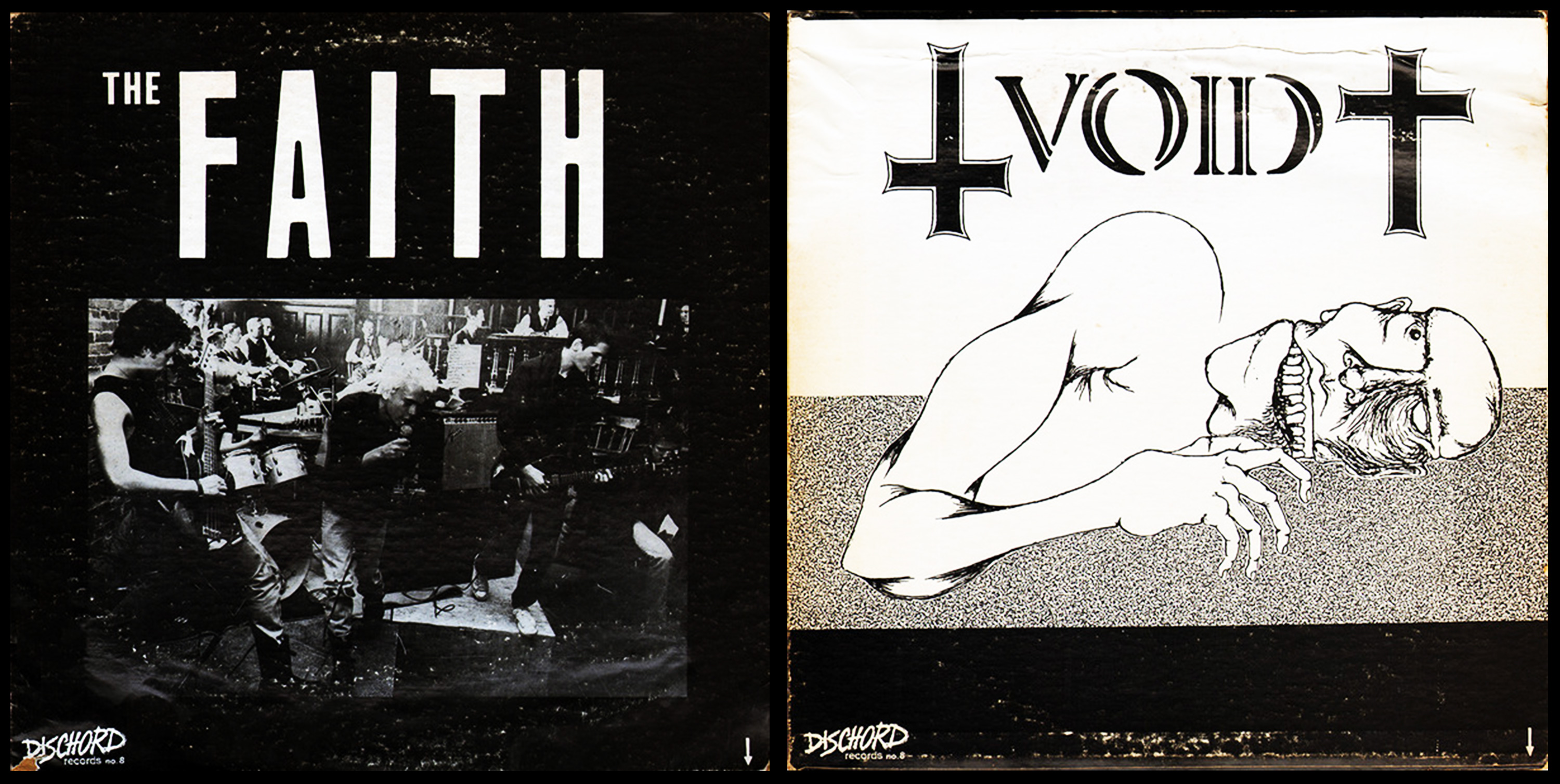


The F/V logo was created by enlarging and cropping the bottom right corner of the “Void” side of the Faith/Void album art. Conceptually, I liked the idea of taking an element of a pre-existing form and creating something entirely new by recontextualizing it. To me, it was a reference to culture’s evolution by building on what came before; by utilizing existing forms and languages to communicate new things under new circumstances.
The arrow works as a directional indicator of something more to be found on the other side. This was utilized to make reference to the shop’s underground location, as well as the nature of the cultural artifacts to be found inside.
The arrow works as a directional indicator of something more to be found on the other side. This was utilized to make reference to the shop’s underground location, as well as the nature of the cultural artifacts to be found inside.